
Interior Stylist Notes: Meet Jessica Jung
Interiors stylist Jessica Jung has styled hundreds of room-sets throughout her career, creating different schemes for traditional and modern spaces which have been photographed by some of the UK’s top publications. We were lucky enough to work with her on our latest photo shoot, giving Jess creative freedom to show how she would style Natasha’s designs in her own home.
With a focus on using only sustainably sourced design brands and working with colours and materials that would show them at their best, Jess takes us through some of her top design tips and brands to know about.

What's the first thing you should think about when incorporating a headboard into your room design?
When you enter a bedroom with a statement headboard, your gaze is immediately drawn to this element, therefore the design process needs to be centred around the headboard at every stage. Starting off the process with mood boards helps to determine the overall look and feel of each bedroom, which is then followed by mapping out elements from bedside furniture, decorative accessories to paint finishes. You should consider all of these elements which need to be working in tandem with the headboard.
CONCEPT 1: BOLD & BLUE
Why did you decide to choose blue as a backdrop to the 'Rose' headboard?
I was particularly inspired by the distinctive silhouette of the headboard - it's almost baroque in feel and I wanted to emulate a feeling of grandeur and eclecticness with the colour palette. This led me to select Edward Bulmer’s “French Blue” which contrasted with the rich green linen and red rose motifs of the headboard, allowing the beautiful intricacies of Natasha’s embroidery to shine. Secondly, with the collection’s inspiration taken from the Cotswold countryside, the combination of blue and green is reminiscent of natural landscapes and as they sit next to each other in the colour wheel - it helps to create an overall calmness within the space.
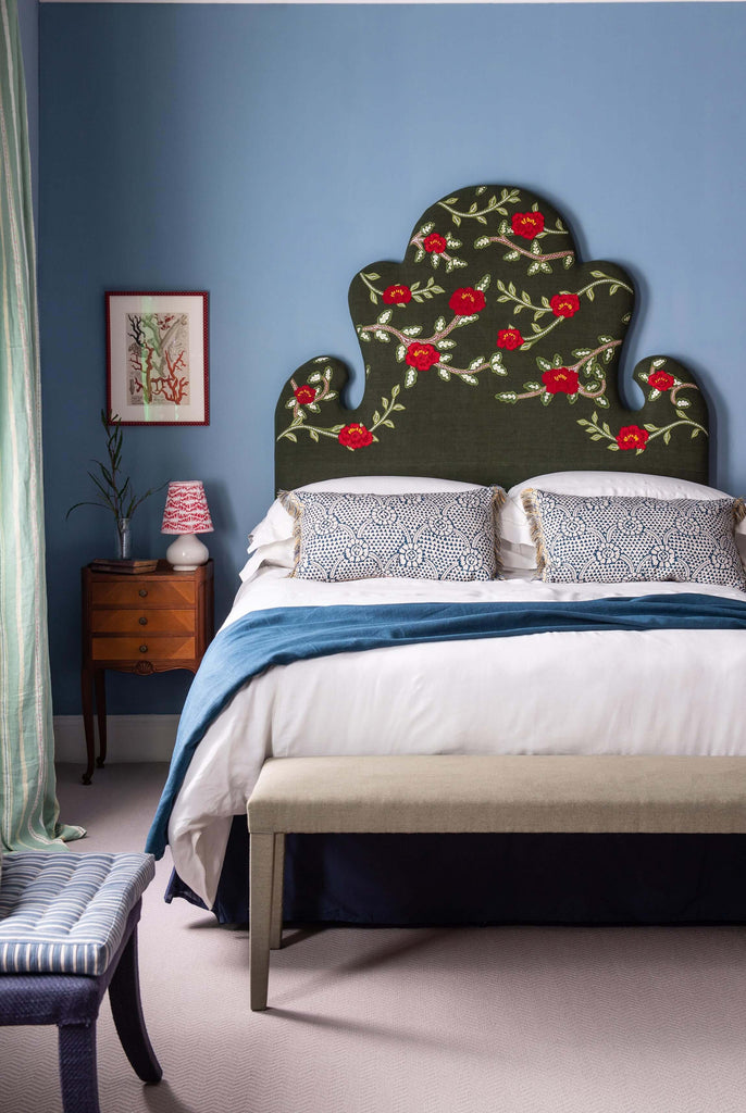
The blue is both unifying and balancing within the scheme, it helps to ground the deep green linen and bright red motifs of the headboard. From there, I chose to layer up design details such as the small scale print of the lampshade, scatter cushions and curtains to continue this narrative of colour accents - informed by the colours in the headboard - throughout the room. The blue works as a foundation for all of these colour accents which helps to bring the scheme together.
How did you choose to furnish the space?
With sustainability at the core of the headboard collection, I was inspired by the use of salvaged linens in the designs to seek out similarly sustainable fabric. This led me to Haines who are a platform that focuses on the resale of surplus fabrics and where I sourced a beautiful fabric for the curtains. Bed linen was sourced from the brilliant Volga Linens who have an extensive collection of naturally sustainable luxury bedding and fabrics for the home to choose from.
In the same breath, all the materials used in the headboard are meticulously made from natural products therefore I wanted to source natural paint for this scheme. Edward Bulmer instantly sprung to mind with their plant based paint which we used across both bedrooms, and we were fortunate to use waste stock of 'French Blue' which was used in this bedroom.
For furniture we then went vintage - focusing on incorporating pieces from Lorfords Antiques extensive collection. I like layering in vintage pieces as they have a lot of individual character and bring more interest to interiors.
CONCEPT 2: COOL, CALM & CLAY

This scheme has a very different vibe to it. What was the thinking here?
In contrast to the blue bedroom, I wanted to stay tonal with this concept to highlight the materiality of the headboard and bring subtle nods to the green embroidery. Making tonal choices throughout the bedding, wall paint and details down to the powdery wooden texture of the antique bedroom bench - this all helped to create a sense of cohesiveness and serenity within the space.
I've used a mixture of antique and contemporary pieces in this scheme to help to create a timeless feel to any space. With this scheme in particular, it was important to highlight the headboard’s craftsmanship and the importance of long-lasting design, therefore it seemed only natural to use vintage pieces that have stood the test of time too.
Where did you source the furnishings for this look?
With the level of craftsmanship and consideration to the environment that has gone into the manufacturing of Natasha's new headboards, it was important to include brands that have followed the same ethos.
Repurposing vintage pieces is a great environmentally friendly way to furnish a space and so we used a lot of classical inspired pieces from Lorfords Antiques. For paint I chose 'Clay' by Edward Bulmer as his whole collection is made from plant based materials - it gives a wonderful finish and the colour is so calming which I think works especially well for bedrooms.
For this set up, I went for bed linen from Bedfolk, which is a brand that has incredibly high standards for both quality and sustainability, all ensuring their designs are made to last. Credentials aside, the softness of their linen bedding beautifully complimented the naturally dyed vintage linen of the headboard.
You can see more of Jessica's styling work at jessicajungcreative.com